In the crowded digital landscape, your restaurant website in India has mere seconds to make an impact. Beyond stunning food photography and seamless online ordering for restaurants functionality, the silent persuader on your page is color. The psychology of color in website design is a powerful, often overlooked digital solution for food business that directly influences perception, triggers emotions, and ultimately, drives conversions. Understanding it is a crucial part of your restaurant marketing strategy 2025.
Why Color Psychology Matters for Your Brand
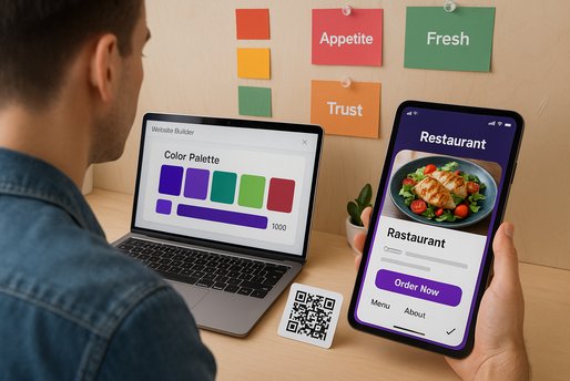
Colors are not just decorative; they are communicative. They convey your brand's personality before a single word is read. For a restaurant, this is paramount. The right color palette can stimulate appetite, convey quality, and build trust, encouraging a visitor to use your QR code food menu or click the order button. The wrong choices can inadvertently signal cheapness, confusion, or even suppress hunger.
This strategic use of color extends across all your digital touchpoints, from your mini website for cafes and social media for restaurants to your WhatsApp ordering system interface. Consistency is key to building a recognizable and trustworthy brand identity that helps you grow restaurant business online.
Decoding the Palette: What Food Colors Communicate
Different hues evoke specific psychological responses. Here’s a breakdown of common colors and their effects in the food industry:
Red: Energy & Appetite
Red is a powerful, primal color that physically raises heart rates and blood pressure. It’s known to stimulate appetite and create a sense of urgency, making it perfect for "Order Now" buttons or promoting sizzling, spicy dishes. Use it as an accent to draw attention to key actions on your food ordering system.
Green: Fresh & Healthy
Universally associated with nature, freshness, and health, green is ideal for brands emphasizing organic, farm-to-table, or vegetarian/vegan offerings. It creates a calming, trustworthy environment. Use it to highlight fresh salads, juices, or sustainable practices on your online restaurant setup.
Orange & Yellow: Friendly & Affordable
These warm, cheerful colors evoke feelings of happiness and friendliness. Yellow is associated with warmth and can stimulate appetite (think of sunshine and ripe lemons). Orange combines the energy of red and the friendliness of yellow, often perceived as a color of good value. They are excellent for fast-casual brands, food trucks, and family-friendly establishments.
Blue: Trust & Technology
Interestingly, blue is a rare color in natural foods and is considered an appetite suppressant. However, it is the world's most trusted color, associated with stability, calm, and intelligence. This makes it perfect for highlighting tech-focused aspects like your contactless menu solution, POS software for restaurants, or restaurant automation tools. Use it to build confidence in your digital systems.
Brown & Black: Premium & Sophistication
Dark earth tones like brown convey richness, warmth, and reliability (think of coffee, chocolate, or wood). Black signifies luxury, sophistication, and premium quality. These colors are highly effective for high-end cafes, artisanal bakeries, gourmet steakhouses, and craft coffee shops looking to position themselves as premium brands.
Case Study: A Color Shift That Boosted Clicks
A cloud kitchen specializing in healthy bowls used a primarily blue and white theme for its mini website, intending to communicate trust and cleanliness. While the site looked professional, the conversion rate for its online ordering was low. Based on color psychology principles, they A/B tested a new design. They kept the clean white background but changed key accent elements and the "Order Now" button from blue to a vibrant, appetizing green. The result? A 17% increase in click-throughs on the button and a 9% uplift in overall conversion rate, directly attributed to the color change making the brand feel fresher and more food-appealing.
Applying Color Theory to Your Digital Assets
Your color strategy should be consistent across all platforms to reinforce brand recognition.
- Website & Mini Website: Choose a primary brand color that reflects your cuisine and personality. Use a neutral background (white, light grey) to make food photos pop, and use your accent color strategically for headlines, borders, and most importantly, call-to-action (CTA) buttons like "Order," "Reserve," or "View Menu."
- QR Code Menu: Ensure your restaurant QR menu design uses the same color scheme. The CTA on the table tent prompting a scan should be in your high-energy accent color (e.g., red or orange).
- Social Media & Ads: Use your brand colors in templates for posts promoting your festival marketing for food brands to create a consistent and professional look that builds trust.
- POS & Billing Software: While you may not control the core UI of your restaurant billing software, ensure any customer-facing screens or receipts incorporate your brand colors.
Metrics to Track: The Impact of Color
How do you know if your color choices are working? Monitor these KPIs before and after any design change:
- Conversion Rate: The ultimate metric. Did more website visitors place an order?
- Click-Through Rate (CTR) on CTAs: Are more people clicking your colored buttons?
- Bounce Rate: Did a new color scheme make people leave your site faster or stay longer?
- Average Session Duration: A more appealing palette can keep users engaged longer.
- Brand Recall: Use surveys or track promo code use from differently colored ads to see which is more memorable.
Color Psychology Implementation Checklist
- Audit your current restaurant website and QR menu color scheme for alignment with your brand identity.
- Choose a primary color that reflects your cuisine (e.g., Green for fresh, Red for energetic).
- Select a neutral background color to ensure readability and make food images stand out.
- Use a contrasting accent color for all Call-to-Action buttons (Order, Reserve, Subscribe).
- Ensure color consistency across your website, WhatsApp ordering graphics, and social media.
- A/B test different button colors to see which drives a higher conversion rate.
- Train staff on brand colors to maintain consistency in offline materials and customer communications.
Color is a subtle yet profound tool in your digital arsenal. It works on a subconscious level to shape customer experience and decision-making. By strategically applying the principles of color psychology, you can transform your mini website for cafes from a simple informational page into a powerful conversion engine that captivates visitors and turns them into loyal customers.
Ready to harness the power of color? Transform your digital presence today.